Learn how to create professional Excel charts with our comprehensive Excel Chart Tutorials collection. From sunburst charts and waterfall charts to treemap visualizations and pictograph charts, master the art of data visualization in Microsoft Excel. Each tutorial includes step-by-step instructions, practical examples, and downloadable resources to enhance your Excel skills
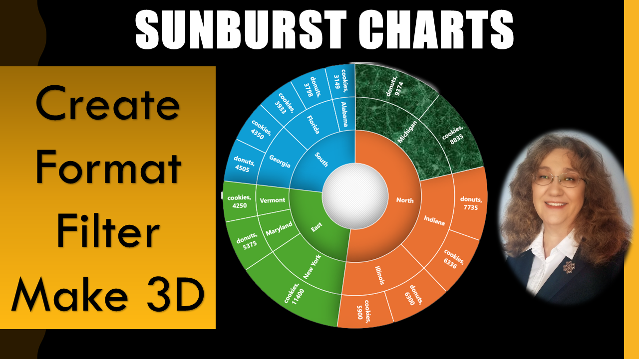
How to Create Excel Sunburst Charts for Hierarchial Data Analysis
Master the Excel Sunburst Chart – a powerful tool for visualizing hierarchical data relationships. This comprehensive tutorial covers creating multi-level categorical breakdowns, customizing chart appearance, and implementing 3D effects. Perfect for business analysts, financial professionals, and data visualization enthusiasts. Learn advanced Excel charting techniques that make complex data easy to understand and present.
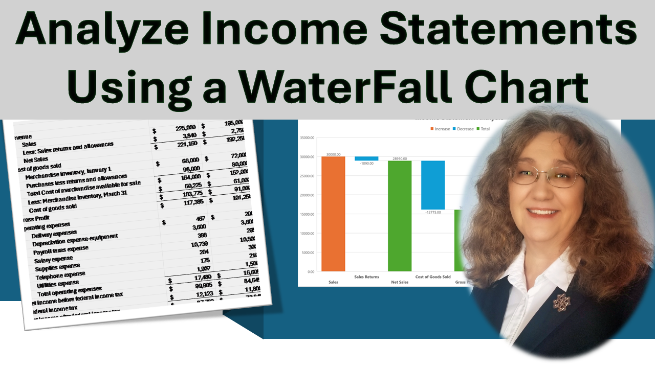
Excel Waterfall Chart: Financial Analysis Made Simple
Transform your financial analysis with Excel Waterfall Charts. This detailed tutorial demonstrates how to visualize income statement changes, track running totals, and identify key financial drivers. Learn professional formatting techniques, data linking strategies, and archiving methods. Essential for financial analysts, accountants, and business professionals who need to present complex financial data clearly.

Master Excel Treemap Charts for Business Intelligence
Discover the power of Excel Treemap Charts for proportional data analysis. This comprehensive guide covers profit distribution analysis, customization techniques, and advanced filtering methods. Learn how to create visually compelling business intelligence dashboards that highlight key performance indicators and data relationships through proportional rectangle visualization.
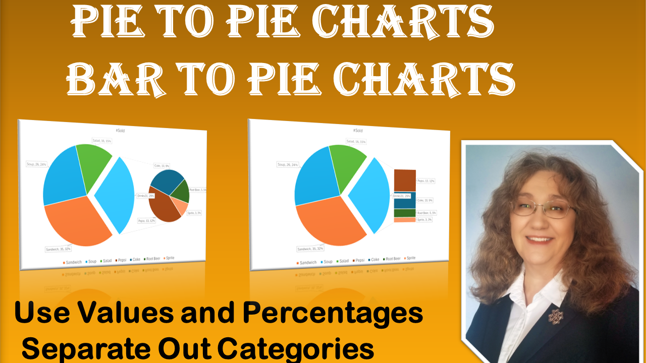
Advanced Excel Pie Charts: Pie of Pie and Bar of Pie Techniques
Learn how to create visually compelling representations of your data using Excel’s Pie of Pie Chart and Bar of Pie Chart. Discover how to create and customize these charts to make smaller items more visible and to separate categories effectively. You’ll learn how to view percentages and values, move segments, and even explode charts for emphasis. Take control of what appears in the second chart based on either percentage or value, or manually select which slices you want to display in each chart. This approach addresses the limitations of a standard pie chart. The Excel Pie of Bar Chart combines the strengths of both pie charts and bar charts, allowing you to present categorical and numerical data in a comprehensive manner.

Excel Goal Chart Tutorial: Track Progress Like a Pro
Maximize your business or organization’s success with the Excel Goal Chart! Learn the ins and outs of creating an effective Goal Chart using dollar values or percentages to visually track progress. Whether you’re presenting in meetings, updating your website, or sharing insights on boards, the Goal Chart is your key to transparent and engaging goal tracking. Follow along as we set a fundraising goal and learn how to customize your chart with text, pictures, and more. Easily share your success story in presentations, fostering collaboration and motivation. Elevate your achievements and keep your team informed about their proximity to targets using this powerful Excel tool. The Goal Chart seamlessly blends numerical data and visually appealing graphics, providing a comprehensive overview of your financial milestones.
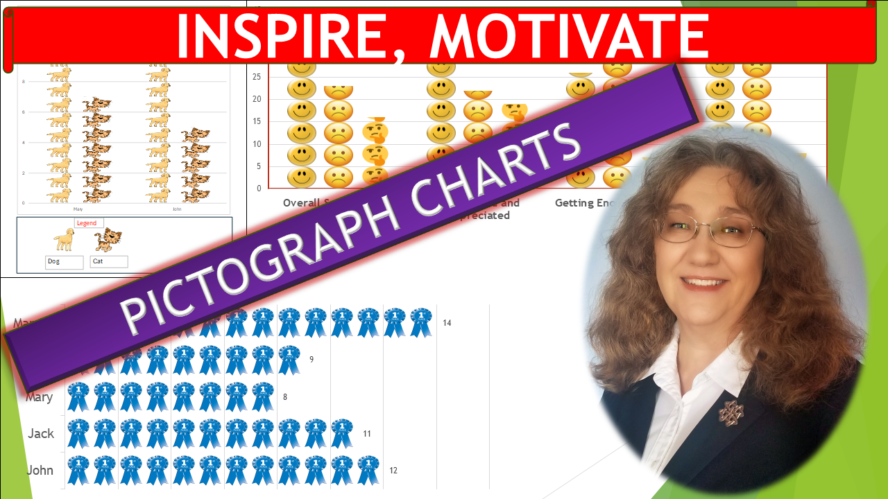
Excel Pictograph Charts: EngagingVisual Data Storytelling
Ready to take your data visualization skills to the next level? Dive into my comprehensive tutorial on creating captivating Pictograph Charts! Designed to empower educators, marketers, and professionals alike, this step-by-step guide will equip you with the knowledge and tools to craft visually stunning charts that motivate, inspire, and engage your audience. I’ll walk you through each stage of the creation process, providing actionable tips and tricks along the way to ensure your charts shine. With my easy-to-follow instructions and interactive examples, mastering Pictograph Charts has never been simpler. Whether you’re a beginner or a seasoned pro, my tutorial caters to all skill levels, allowing you to unleash your creativity and bring your data to life like never before.
